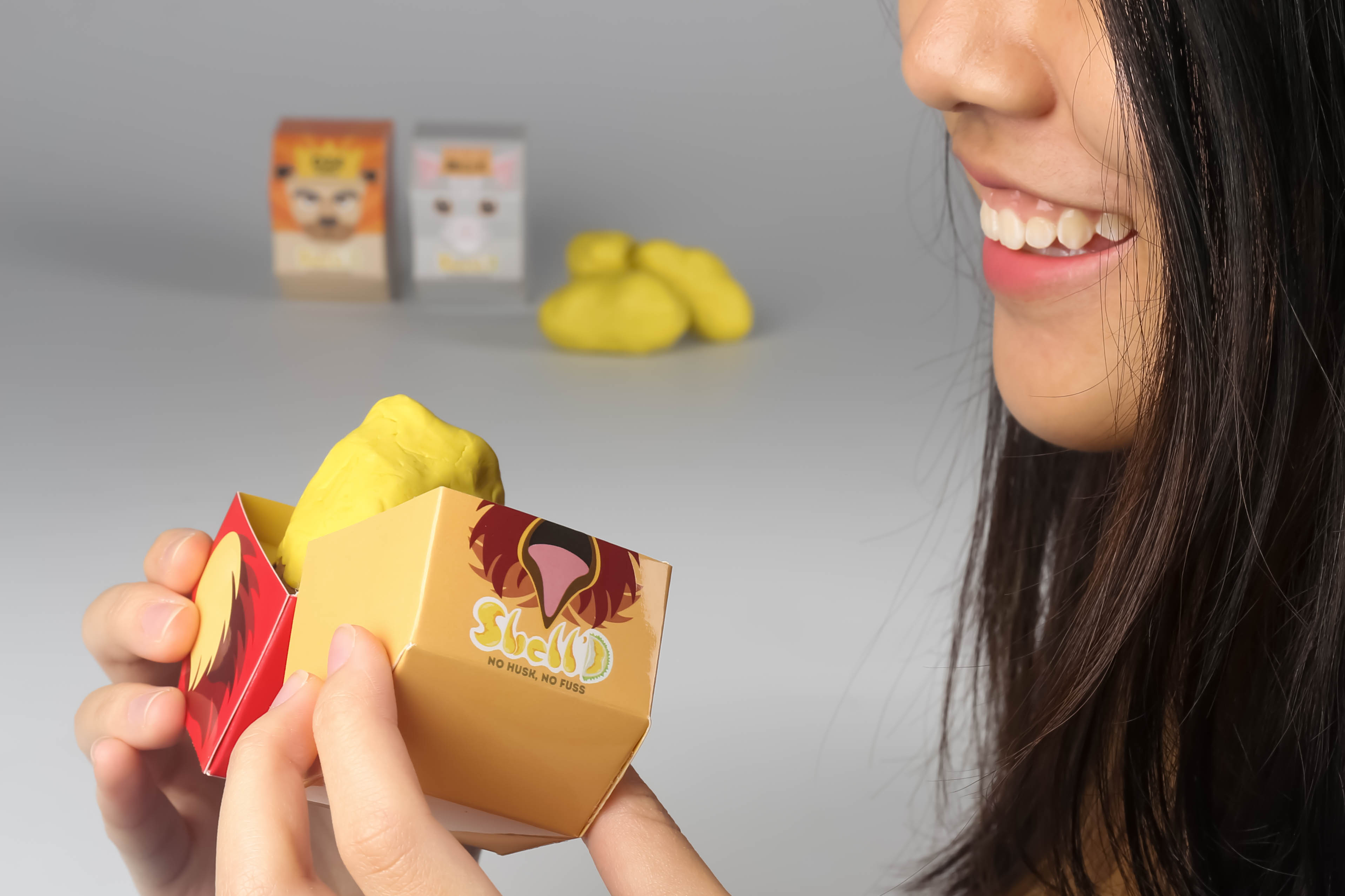
Shell’D
ASPaC Awards
ASPaC Awards 2017 allowed me to explore ways to create a packaging that benefits the users' experience and concepts of brand identity. We had to design a packaging for a product that has never been packaged before. For me, I chose to package a single durian seed as a whole durian can be bulky and consumers might not be able to finish the whole durian in a go. The challenge here was to create a packaging that would benefit the users' experience and I managed that by designing a box that holds the durian snuggly and I've included two holders inside the box to allow consumers to enjoy the durian without having to use their fingers.


About Shell’D:
It’s a challenge to pry open durian husk without the right tools and skills. The name Shell’D came about as the durians we sell are taken out of their husk. Durian as a whole is huge and bulky and it’s inconvenient to bring them around. It’s also tricky to lug durians around if you’re considering of getting various types of durians as a whole. Shell’D durians are sold in single portions to allow consumers to buy various flavours at once. The packaging also makes it more portable for consumers. Our packaging also allows you to devour your durian without using your fingers to prevent the pungent smell from lingering.
Packaging Ideation:
Durians sold in supermarkets: Usually sold with just the flesh in cling wraps
Disadvantages:
- Not completely air tight, smell still escapes
- Takes up lots of space as it can’t be stacked
- Packaging isn’t appealing
Durians sold in durian stalls: Opens durian in front of you, eat it right away/ within the next day
Disadvatages:
- Shorter shelf life
- Durians are stacked up unevenly
- Strong smell
Aim of the packaging:
- Easy identification of the types of durians
- Single portion consumption
- Easy consumption without dirtying your hand
Experimentations:

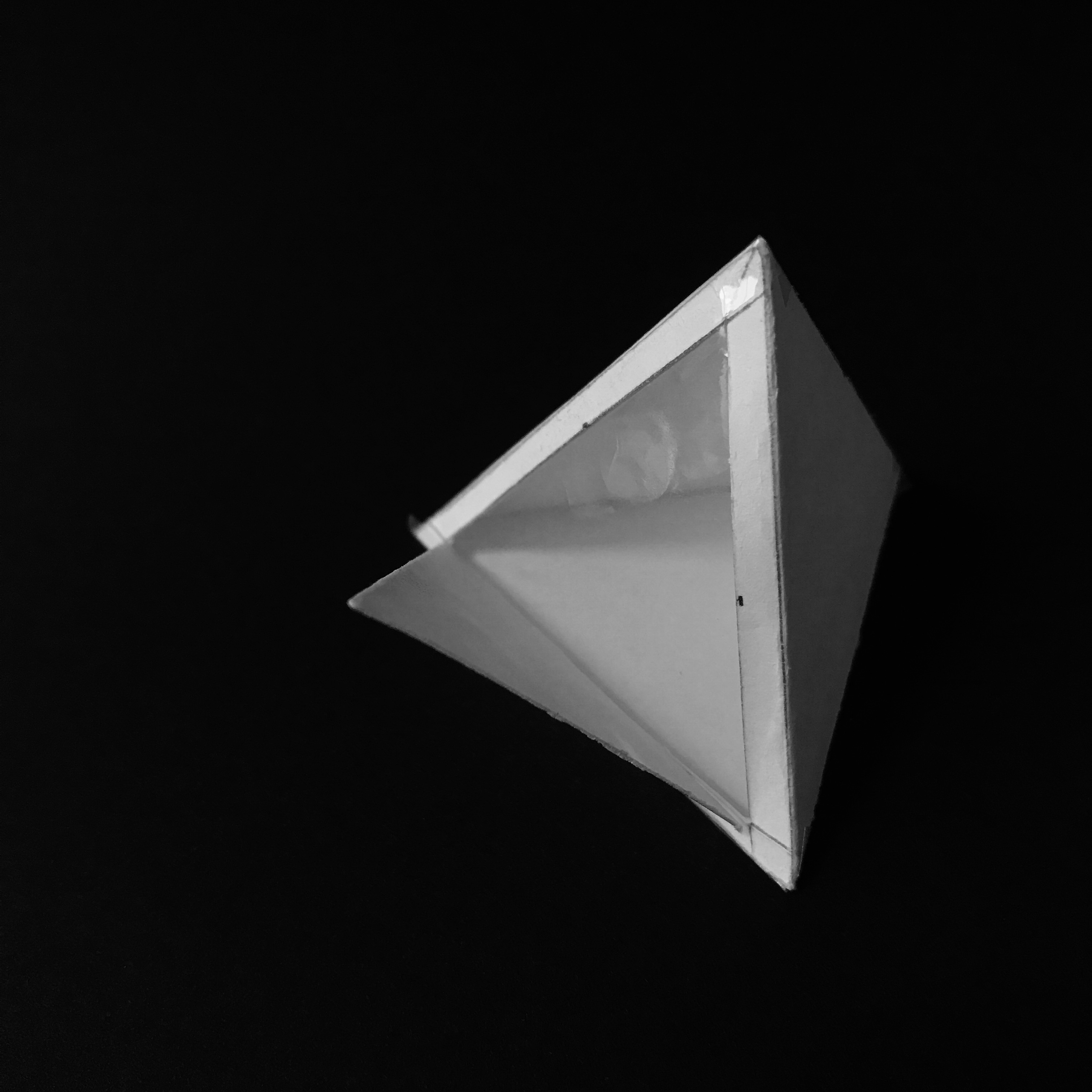


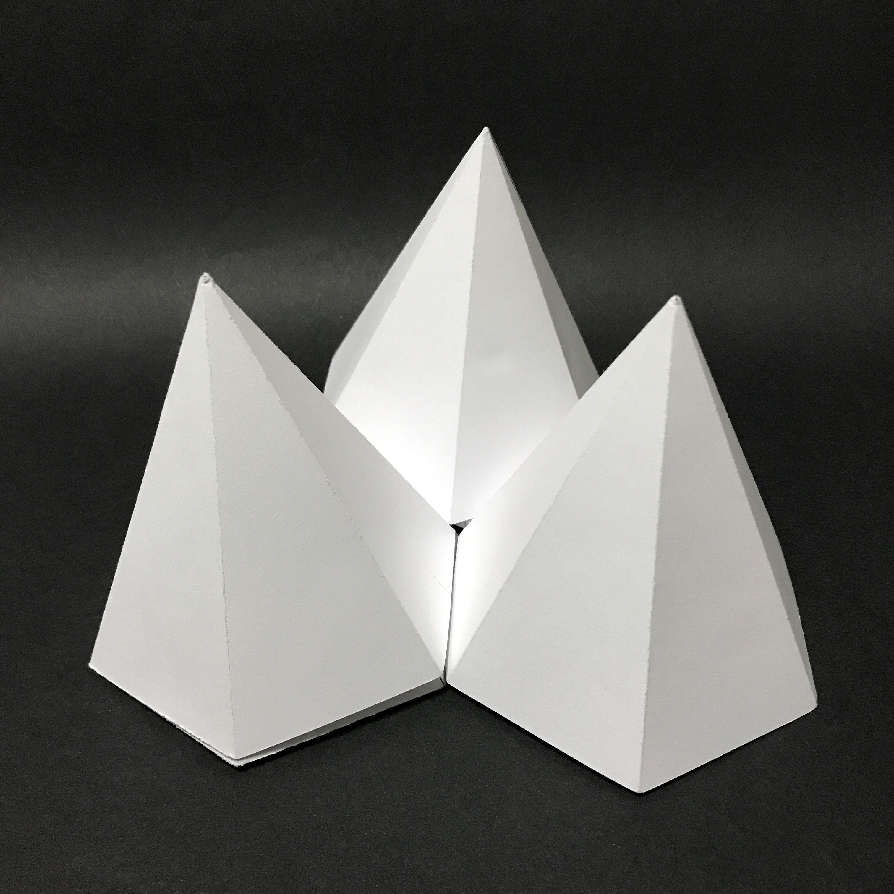
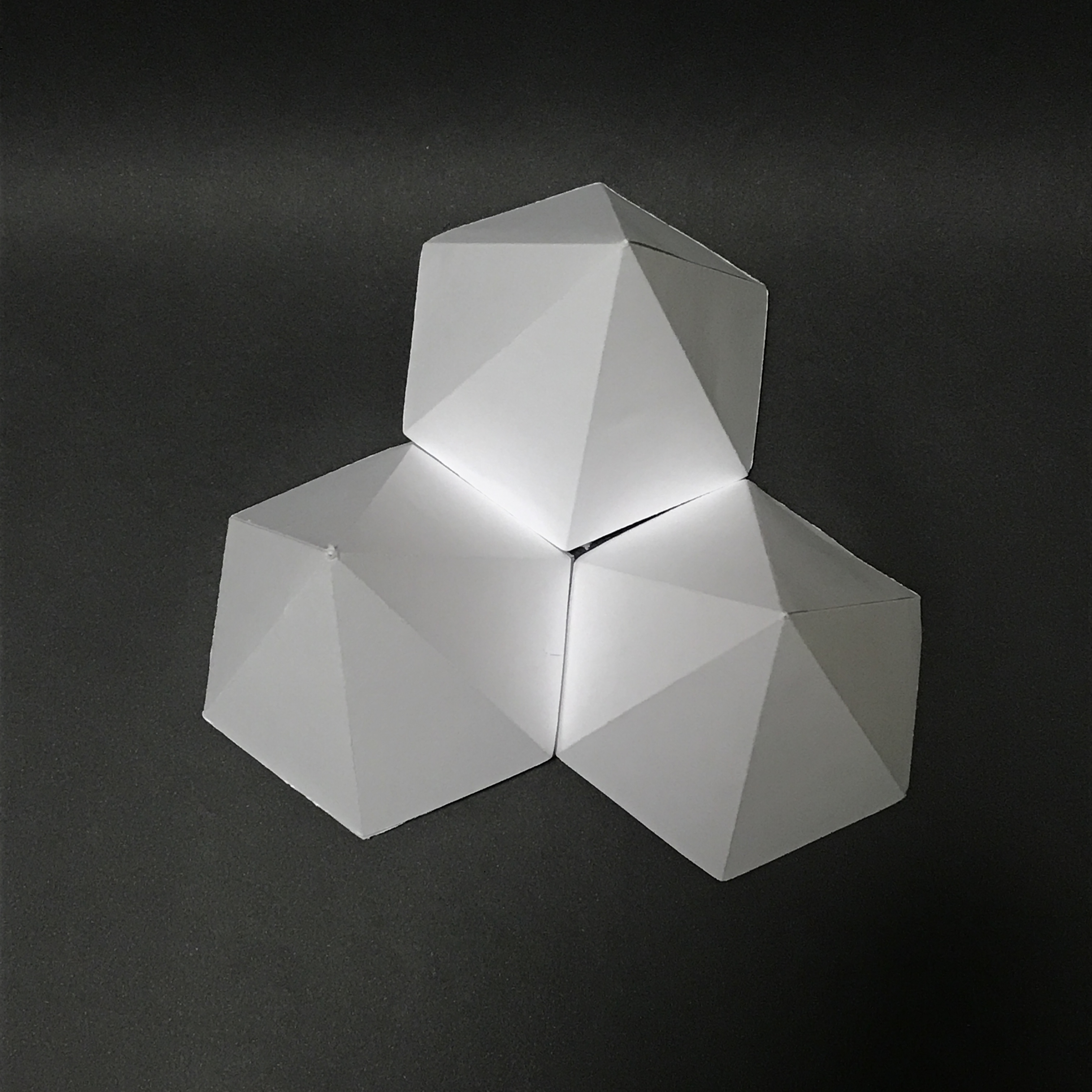
Final Packaging:


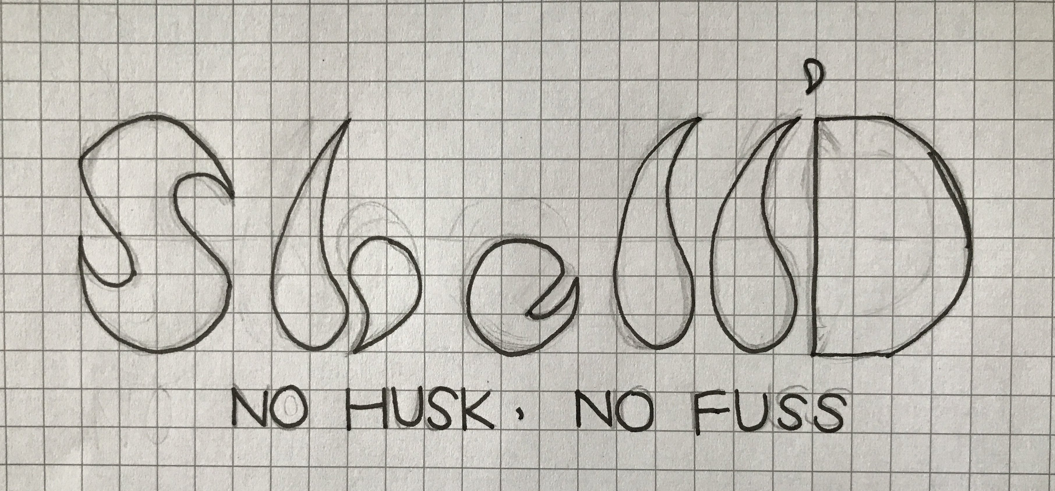
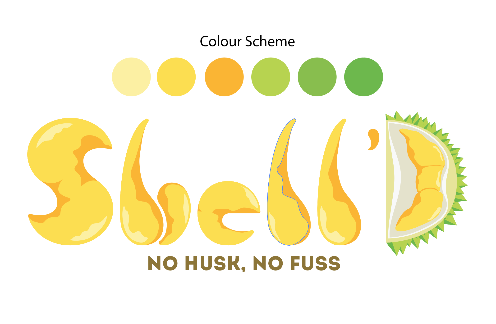
Brand Name & Slogan: The typeface is inspired by the shape of the durian meat. The ends of the meat are soft and mushy therefore creating the sharp end for the letterform.

Graphics:Graphics on the packaging helps consumers to differentiate the types of durians. Animals are used to represent the different types of durians.
Mao Shan Wang
Using a cat to represent the ‘Cat Mountain King’ as translated from the Chinese characters.
D24
Also known as the King of durians is represented by a lion. As lions are the king of animals.
Golden Phoenix
Represented by a phoenix colours on the packaging are inspired by the colours of a phoenix.
